Cyanová And The Colour Cyan Explained In Simple Terms
Cyanová is the Slovak feminine form connected to cyan, the vivid blue-green colour. This guide explains the word, the colour, and how cyan is used in design and printing.

If you have come across the word cyanová and wondered what it means, here is the answer in plain terms: cyanová is a Slovak word, the feminine form of an adjective that relates to cyan, the vivid blue-green colour. In other words, where English would say “cyan” to describe a colour, Slovak changes the ending of the word depending on the noun it describes, and cyanová is the form used with a feminine noun. It is, at heart, a colour word, and understanding it is really about understanding two things: a little bit of Slovak grammar, and the colour cyan itself.
This guide covers both. It explains how cyanová works as a word, what cyan looks like and where you meet it in everyday life, and why cyan matters so much in design and printing. No prior knowledge of Slovak is needed, and no design experience either. By the end, the word should feel much less mysterious.
What Does Cyanová Mean?
Cyanová means, in essence, “cyan” as a describing word, used in its feminine form. To make sense of that, it helps to know one basic fact about Slovak: adjectives in Slovak change their endings to match the noun they describe. Nouns in Slovak belong to one of three genders, masculine, feminine, or neuter, and the adjective shifts its ending to agree with the noun’s gender. English does not do this at all, which is why the idea can feel unfamiliar at first. In English, “blue” stays “blue” whether you are talking about a car, a dress, or a sky. In Slovak, the equivalent word changes its shape.
So the adjective for cyan has different forms depending on what it describes. Cyanová is the form that goes with a feminine noun. A common example is the word for colour itself, which is feminine in Slovak, so the phrase for “cyan colour” uses the cyanová form. If the same colour were describing a masculine noun, the ending would be different, and likewise for a neuter noun. The stem of the word, the part that carries the meaning of cyan, stays the same throughout. Only the ending moves.
This pattern is not special to cyanová. It applies across the whole language, to colours and to describing words in general. Once you grasp that adjectives agree with their nouns in Slovak, cyanová stops looking like a strange, standalone word and starts looking like exactly what it is: one member of a small family of forms, all meaning the same colour, each fitted to a different kind of noun.
| Feature | What it means |
| Language | Slovak |
| Word | cyanová |
| Type of word | Adjective, feminine form |
| Meaning | Cyan, the blue-green colour |
| Why the ending changes | Slovak adjectives agree with the gender of the noun they describe |
| English equivalent | Simply “cyan” |
Where You Might Come Across Cyanová
You are most likely to meet cyanová in written Slovak, in places where colours are being described. That could be a product description, a piece of writing about art or design, a catalogue entry, or an online listing where the colour of an item matters. Because colour is such a practical detail when you are choosing clothes, home furnishings, or craft materials, colour words turn up constantly in everyday Slovak text.
You might also see it if you are learning Slovak and working through vocabulary for colours. Colour words are among the first adjectives learners meet, because they are useful, concrete, and easy to practise. Cyanová is a good example of how a borrowed, modern colour word fits into the Slovak system: the root comes from the international colour name cyan, and the Slovak grammar supplies the ending that makes it work in a sentence.
It is worth noting that cyanová is not a name, a brand, or a title. It is simply a descriptive word. If you see it attached to a product or in a description, it is telling you about colour, nothing more exotic than that. And if you see it in a sentence, the word next to it, the noun it describes, will be feminine, which is why this particular form was chosen rather than one of its relatives.
What Is the Colour Cyan?
Cyan is a bright, vivid colour that sits between blue and green. If you picture a tropical sea on a sunny day, or a clear summer sky at its most intense, you are somewhere close to cyan. It is not a pale or muted shade. At its full strength, cyan is striking and luminous, the kind of colour that catches the eye immediately.
In everyday language, people sometimes use “cyan” and “turquoise” or “aqua” loosely, as if they were the same thing. They are related, and they all live in the same blue-green family, but they are not identical. Turquoise tends to lean a little more towards green and often feels slightly softer, while aqua can be used more broadly. Cyan, in its precise sense, is the balanced blue-green that sits exactly between blue and green, with neither side dominating. When people in design and printing say cyan, they usually mean that precise, balanced colour.
Cyan also has a particular quality that sets it apart from many other colours: it feels both natural and artificial at the same time. It appears in nature, in water and sky, yet it also has a distinctly modern, technological feel, because it is one of the colours that screens and printers use to build the images we see every day. That double character is part of why cyan shows up so often in logos, websites, and advertising. It can feel fresh and clean, energetic and futuristic, or calm and open, depending on how it is used.
Cyan in Everyday Life
You do not need to be a designer to meet cyan regularly. It is all around, in places you probably notice without thinking about it.
The most obvious examples come from nature. Shallow tropical water often looks cyan because of the way light behaves in clear water over a light-coloured sandy bottom. A bright sky can also lean towards cyan, especially on a clear day when the blue is at its most vivid. Swimming pools, particularly when lit from within, often have a cyan tint for the same reason: light passing through clear water picks up that blue-green character.
Then there is the world of screens. If you have ever looked closely at a television, a phone, or a computer monitor, you have seen cyan produced by light itself. Screens build every colour from tiny dots of red, green, and blue light, and cyan appears when the green and blue dots shine together at full strength while the red stays off. That is why cyan looks so bright and glowing on a screen: it is literally made of light.
Print is the other place cyan is everywhere, though it is less obvious there because printed cyan is made with ink rather than light. Magazines, packaging, posters, and photographs all rely on cyan ink to reproduce the blue-green parts of an image. Without it, printed pictures would lose a whole range of colours, from skies and seas to clothing and product shots.

How Cyan Works in Design
For designers, cyan is both a tool and a challenge. Its brightness makes it excellent for drawing attention, which is why it is often used for highlights, buttons, links, and accents on websites and apps. A small patch of cyan on an otherwise neutral page jumps out immediately, and that makes it useful when you want the eye to land somewhere specific.
At the same time, cyan’s intensity means it needs handling with care. Used across a whole page at full strength, it can feel overwhelming or tiring to look at, especially on a screen. Designers therefore often pair cyan with darker or more neutral colours, such as deep navy, charcoal, white, or grey, which calm it down and let it work as an accent rather than taking over. A dark background with cyan highlights, for example, is a popular combination because the contrast makes the cyan glow without flooding the whole design.
Cyan also carries associations that designers think about. Because it resembles clear water and open sky, it often feels fresh, clean, and trustworthy. Companies that want to suggest clarity, technology, or environmental friendliness sometimes lean on cyan for that reason. But associations are never fixed, and the same colour can feel playful in one context and corporate in another. What matters most is how it is combined with other colours, with type, and with imagery.
A few practical tips illustrate how cyan is typically handled in design:
- Use cyan as an accent, not as the main background, unless you are deliberately aiming for a bold, high-energy look.
- Pair it with dark neutrals or white to keep it readable and balanced.
- Check how it looks on different screens, because cyan can vary noticeably from one display to another.
- Combine it with its neighbours, blue and green, for a calm, natural palette, or with warm colours such as orange for strong contrast.
- Remember that text in cyan on a white background can be hard to read, so save cyan text for large headings or short labels rather than long paragraphs.
Cyan in Printing
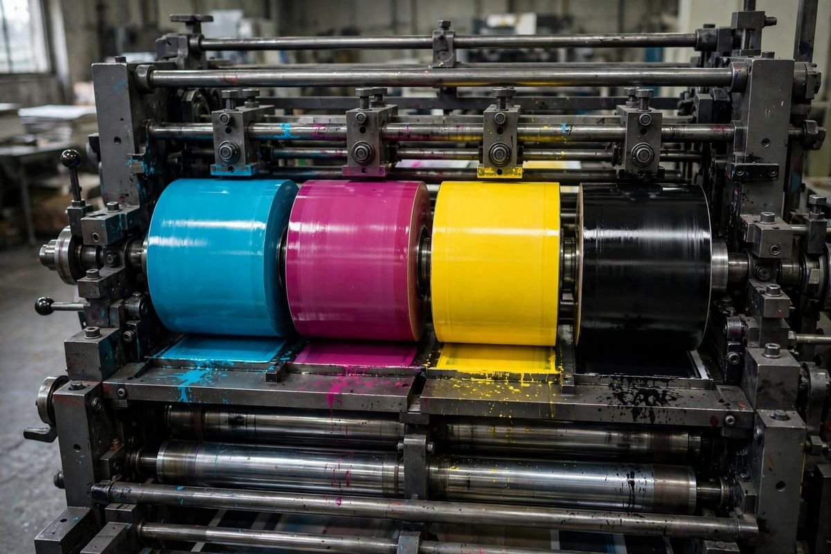
Printing is where cyan earns its keep most quietly, and it is also where its role is most precisely defined. Colour printing generally uses four inks: cyan, magenta, yellow, and black. This system is known by its initials, CMYK, with K standing for black. Almost every colour photograph or illustration you see in print is built from tiny dots of these four inks, layered and mixed in different proportions.
In that system, cyan is not just a decorative choice. It is one of the building blocks. Blue skies, green leaves, ocean scenes, and countless everyday objects all depend on cyan ink to look right. If you remove cyan from a printed image, the picture changes dramatically: blues turn purple or disappear, greens turn yellowish, and the whole image looks warm and wrong. Printers therefore treat cyan as essential, not optional.
There is an important difference between cyan on screen and cyan in print that is worth understanding. On a screen, colours are made by adding light, and adding more light makes things brighter. In print, colours are made by subtracting light: white paper reflects light, and ink absorbs some of it, so adding more ink makes things darker.
Cyan ink absorbs red light and reflects blue and green, which is why our eyes see it as blue-green. The same colour name therefore describes two different processes, one with light and one with ink, and the exact shade can shift between them. That is why a design that looks perfect on screen sometimes needs adjusting before it prints well, and why printers check proofs carefully.
For anyone preparing something for print, a few points about cyan are worth keeping in mind. Rich, deep colours often need a good amount of cyan in the mix, while pale, delicate shades need very little. Large areas of solid cyan can show up unevenly if the printing is not well controlled, so designers sometimes avoid huge flat blocks of it.
And because printed colour depends on paper, ink, and press conditions, the cyan in a finished print may look slightly different from the cyan on a monitor. None of this makes cyan difficult to use, but it does explain why print professionals treat it with respect.
Shades, Tints, and Variations of Cyan
Cyan is not a single, fixed shade. Like every colour, it has a family of variations. Add white, and you get paler, softer versions that feel airy and gentle. Add black or a darker colour, and you get deeper, moodier versions that feel more serious. Shift slightly towards blue, and the colour feels cooler and more technological. Shift slightly towards green, and it feels more natural and relaxed.
These variations are part of why cyan is so versatile. A pale cyan can suit a bathroom, a nursery, or a calm, minimal website. A deep cyan can suit a formal brand, a winter collection, or a dramatic poster. The vivid, full-strength cyan suits energy, sport, technology, and youth. The word cyanová, in Slovak, can in principle describe any of these, because it names the colour family rather than one exact shade. If a more precise shade is meant, the description will usually add another word to narrow it down.
This flexibility is also why colour words sometimes cause confusion across languages. One person’s cyan might be another person’s turquoise, and a shade that looks cyan in one light can look blue or green in another. That is normal. Colour perception depends on lighting, on surrounding colours, and on the screen or paper involved. The word gives a good guide, but the eye always has the final say.
Learning From a Single Word
There is something satisfying about tracing a single word like cyanová back to its roots. It starts as a curiosity, a word you do not recognise, and it opens out into a small tour of language and colour. You learn that Slovak adjectives change with gender, which is a key to reading the language more generally. You learn that cyan is a precise colour with a specific place between blue and green. And you learn that this one colour plays a central role in the screens and printed pages you use every day.
Words like cyanová are also a reminder of how languages borrow from each other. Cyan itself comes from a Greek root meaning dark blue, and it travelled through science and technology into many languages, including English and Slovak. Each language then fitted it into its own system. English kept it simple, using the same form everywhere. Slovak gave it a set of endings, so that it could agree with the nouns around it. The result is a word that looks foreign at first glance but follows perfectly ordinary rules once you know them.
If you are learning Slovak, cyanová is a useful word to keep in your pocket. It teaches you the feminine adjective ending, it gives you a colour you can actually use in conversation, and it connects to a colour you already know from everyday life. If you are simply curious about a word you stumbled across, it is a good example of how much a single unfamiliar word can contain.
FAQs
What does cyanová mean in English?
Cyanová means “cyan” in its feminine adjective form. It describes something as being the blue-green colour cyan, and it is used when the noun it describes is feminine in Slovak.
Is cyanová a Slovak word?
Yes. Cyanová is Slovak. It is built from the international colour name cyan, with a Slovak adjective ending that marks it as feminine.
What colour is cyan?
Cyan is a vivid blue-green colour, sitting exactly between blue and green. Think of bright tropical water or an intense clear sky. It is brighter and more luminous than a muted teal, and more balanced than turquoise.
Where is cyan used in design?
Cyan is widely used as an accent colour in web design, apps, logos, and advertising, because its brightness draws the eye. Designers often pair it with dark neutrals or white to keep it balanced and readable.
Why is cyan important in printing?
Colour printing uses four inks: cyan, magenta, yellow, and black, known as CMYK. Cyan is one of those four building blocks, and without it printed images would lose their blues and greens and look completely wrong.
How is cyan made on a screen?
Screens create colours from red, green, and blue light. Cyan appears when green and blue light shine together at full strength while red light is off, which is why cyan looks so bright and glowing on a display.
Does cyanová refer to a specific shade?
Not exactly. Like the English word cyan, cyanová names the blue-green colour family. A paler or deeper version of cyan would usually be described with an extra word to make the shade clear.
Wrapping Up
Cyanová is a small word with a clear meaning: it is the Slovak feminine form of the adjective for cyan, the vivid blue-green colour. Behind that simple definition sits a neat piece of Slovak grammar, a colour that bridges blue and green, and a shade that quietly powers much of the visual world, from the screens we look at to the printed pages we hold.
Whether you met cyanová while reading Slovak, learning the language, or browsing a product description, you now know what it is telling you. It is telling you about colour, and specifically about one of the most distinctive colours there is: bright, fresh, and unmistakably cyan.
Read Also: Joh Jos Meaning, Winery And Name Origins (2026 Guide)
Related Stories

Lord of the Rings T Shirt: Styles, Designs and Buying Guide
A Lord of the Rings t shirt is the easiest way to wear Middle-earth. This guide covers the…

Adidas Men’s Trefoil Essentials Oversized Cotton T-Shirt
The adidas men's trefoil essentials oversized cotton t-shirt pairs a relaxed, roomy fit with the classic Trefoil logo.…

Armenian: Language, People, Culture and History Guide
What does Armenian mean? A friendly guide to the Armenian language, its unique alphabet, the Armenian people, and…
1 response